Is this one of the reasons why eMailers fail to deliver?

Pin It Now!
 eMailer

Landing page

Here's a bummer with Electronic Direct Mail (EDMs) or eMailers that's oft repeated.

I got this in mail today with this hook: "Opt for 25 years of fun-filled holidays in beautiful locations at today's prices. Ask for the Sterling Holidays Vacation Ownership plan." And the carrot - EMI starting at Rs.3011.

I'm sold. Though the copy could have been crafted better. You're telling me that I can enjoy 25 years of vacations at the price I pay today. That I will be paying today's price tomorrow when others, poor souls, would be paying much, much more for the same comforts I would enjoy. Shouldn't that be put forth better?

Never mind the sterile line "The best way to enjoy your vacation is to own it".

But I'm still sold. So I click on the call to action button, and ...

Err, I come to the same page again, or ... oh there's a form that looks rather intimidating. But yes, now that my eyes have explored the landing page, I see that there's something new to do here. I see that I am on different territory, though it doesn't look any different from the eMiler. But why are you repeating the copy on the eMailer here as well? And the design? I, for a moment, thought I'm being thrown the same eMailer in the guise of a web page again. 

I would have imagined that after selling me on fun-filled holidays that I would actually be shown the "fun" in pictures. Loads of pictures, maybe a collage of all the destinations as a continuation of the promise made to me on the mailer. Nada.

The landing page leaves much to be desired. A rather lame effort with an intimidating form field that makes me uncomfortable because it gives me the "big brother is watching you" feeling. Why, for instance, should I reveal what my occupation is? Or the type of vehicle I own? So, ok, I am 007 and I work for Her Majesty's Secret Service. I own a fully loaded Aston Martin that is an amphib, a Portobello and an office rolled into one. Could I have my Sterling Holidays Vacation Ownership, please.

Or wait. Maybe not.

You haven't really sold me. You see, at the "Golden Moment of Gratification" when I clicked the call to action button and came to the clone landing page, you lost me. It's the clone that gave the game away and the form field that is rather probing. I don't really see the fun of owning a Vacation with you, because your landing page isn't fun. But yes, now that you have sufficiently piqued my curiosity, I just might go out there and look for Vacation Ownership deals. 

I just might chance upon one that I like. Thank you for opening up the world of owned vacations, even if it isn't your own. See how you have effectively sold your competitor's service? If only you would do that with your own.
Pin It Now!

Lessons in WOM from Brief Buddy

Pin It Now!


This came in mail today. The image you see above of Brief Buddy. And the little write up below, under the sub head BRIEF BUDDY.

What struck me is the eminently sensible technique used here to leverage bloggers to spread the message about an impending product launch. The creators simply made the blogger's job easy by providing the write-up of the product and the necessary image to accompany the post. (Websites do it all the time to aid media professionals by having a media section with logos and company profiles. Maybe that's where the idea stems from.)

I must try this for one of my clients. That said, what is Brief Buddy?

BRIEF BUDDY
Worlds First Creative Brief Cracking (Smart Phone) App

Brief Buddy is a smart phone application in development, aimed solely at helping advertising industry creativesʼ crack creative briefs.

The app claims to feature a multitude of brief cracking techniques, tips and insights from many top creativeʼs as well as a number of examples of creative executions.

Brief Buddy will be officially launched late June 2011, and will be available on the App Store for iPad, iPhone and iPod Touch as well as the Android Marketplace.

Me thinks 'brief cracking' is best left to the mind, unaided by devices. But if distractions out weigh your mind and singular, delicious, old-world 'brief cracking' is a bit too old-world for you, you might want to give Brief Buddy a try.

Here's how Brief Buddy could have made this novel PR/WOM exercise of tapping bloggers better:
  • Create a website that actually tells you more. It doesn't presently. There is no actionable link, just a text box to capture e-mail IDs. It fails to deliver on the promise "know more".
  • If this is the world's first initiative of its kind, let the excitement show! Have a well made video and snippets from minds in the industry contributing to the project, to begin with.
  • Craft the copy of the PR document before mailing bloggers. Remember that they will have to believe in the product themselves first.
  • Revisit creative and check if the message being conveyed is unambiguous. The image above says "Coming soon to iPhone Android", which in effect tells me that there is already a platform of the application on the WWW - but there isn't.
  • As a corollary to the above point, rephrase "Worlds First Creative Brief Cracking App" to "Worlds First Creative Brief Cracking Smart Phone App". Make the communication perfectly clear. We're talking about a world's first product here.
Brief Buddy launches late June 2011.
Pin It Now!

Social Media - Why most biggie companies get it all wrong

Pin It Now! There's something very fundamental about Facebook - it's certainly not for a make-my-logo-bigger brand or corporate entity. Neither is it for a brand or corporate that comes on strongly, which in social terms is offending, to put it mildly. That might have worked even in the late nineties. Certainly not today. But like the vestiges of the Raj still linger in the corridors of power, “trader mentality” still lingers in the biggie, oldie corporate corridors.

In the world of Facebook, you cannot talk just about yourself. That’s not a conversation.

I suppose this is a fact that's completely lost on the biggies. And brand guidelines are to blame to a large extent. These dated guidelines are a big damper to getting the best out of Facebook. The reason might be because Facebook or even social media wasn't taken into the picture when these guidelines were made.

Facebook is a liberating medium founded in the Age of Conversation. And therefore, like all social media platforms, it is a platform for conversation - NOT ONE WAY COMMUNICATION. Big brands need to understand this, APPRECIATE this fact and move with the times.

Yes, in the process there will be conversations that make brands uncomfortable. (Isn't that bound to happen in a conversation with millions?) But today, in 2010, you as a brand or corporate entity need to focus on delivering an exceptional customer experience through your social media platform without acting as the mouth piece of your marketing department.

That’s how you’ll garner the respect of your community and get a huge following. Otherwise, there’s another option, the old school way of doing things - without the social media component. Pin It Now!

This is (digital) enticement...

Pin It Now!

And Citibank has got it down pat to the last detail. Well almost. I would have liked fine line separators between offers to accentuate each that much more. But "culinary drives"? That bit of copy could have been put better. That said, the mailer is truly appetizing. Target achieved. They almost had me reaching for my card.

Strangely, I didn't click on the 'Look for more' button. Perhaps I wasn't inclined to succumb to the temptations of this delicious mailer, just then. Or should the call to action have been better worded, made more tempting? Or should it have been bigger? Or of an unusual shape? I'm not sure. These are just musings.

I only wish all mailers were as appetizing, addressing the target, capturing their attention and even prompting them into immediate action, instead of just catering to the whims of clueless product managers and marketing heads. Pin It Now!

Nothing like making the best of the web... like Bakon does

Pin It Now!
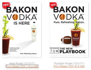
How often do you see a brand using the web as an enabling tool? Yes, there are various instances. But here's one that's stand-out different. Bakon Vodka (that's bacon flavored vodka) has a whole page of print-ready posters, sell sheets and shelf talkers (POPs in short) right there on their website.

That's enablement. You can check them out here.

A ten-on-ten in my book, also considering all the variables and dynamics involved in arriving at a collective decision to put one's POPs in the public domain, free to download. Pin It Now!

Sometimes you can't achieve online, what you could achieve in print

Pin It Now!

We open each mailer with one question in mind - what's in it for me?

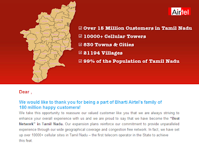
So when you get a mail with a subject line that reads 'Airtel On Your Side', what would you expect? A tom-tom? Self-congratulatory PR and marketing drivel? Here's Airtel doing just that. And in the process letting me know that because of me, they are numero uno. That they are the fifth best technology company in the world et al.

Congratulations!

But, again, what's in it for me? Why send me an e-mailer to pat yourself on the back? You could have done that in print. Now there I would have probably read you over my morning cuppa, and not felt so let down nor been belligerent about it. I mean, my newspaper habit is way different from my online habit.

Does that tell you something? Pin It Now!

Why you should never use the word 'discipline' in financial advertising

Pin It Now!

• Because you would be talking down to a grown-up, which you wouldn't want to do as a smart marketer

• Because it simply reminds a grown-up that he or she is possibly undisciplined, which is something he or she wouldn't want to admit even to themselves

• Because, in a majority of cases, it tells a grown-up at an un-solicited moment that he or she could have done better in life…

None of the above bodes well in promoting a financial product, because you start off rubbing your prospective customer the wrong way. And none of the above is rocket science as far as insight is concerned. Neither do you need a detailed study to confirm what your gut instinct already tells you.

Yet we see communication after communication, especially in the Mutual Fund industry taking about 'discipline'. Pin It Now!

More shoppers could stop by if only...

Pin It Now!

... you'd let them see immediately what they would be stopping by for.

You've already told me your name in the 'From' field of the e-mail. I've read it, which is one of the reasons I opened your mail.

Next you've also told me "Hot picks for April! Exciting new Summer Collections." in your subject line. I've read that too and that is the other reason why I opened your mail.

And what do I see?

A bold header repeating "Hot picks of the month" again. I already know that. Can we cut to the chase? Could you please let me see what I opened to see?

Oh. I have to scroll to do that? Mmmm.

Know something? You could have easily lost me. Your whole point in sending me this e-mailer would have been wasted, had I not scrolled down. Had I not ignored the repeated headline pitch. If you had hooked me at my perceived moment of gratification, which was as soon as I opened the mail in anticipation, you would have made a soft conversion. (I say soft because I hardly buy clothes online. I like the touch and feel shopping experience better).

But you would have scored never-the-less. Pin It Now!

So that's how 'clicks' are measured!

Pin It Now!

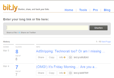
I use bit.ly frequently. Like I just did to shorten the URL of my blog post, the one below this post. Ten minutes later I'd registered 3 clicks.

And then for some reason I clicked on my post link on bit.ly. It opened my blog post in the same window. So I clicked the back button on my browser to go back to bit.ly and... tada! My click count had risen to four. So I did this little 'click and back' thing another 4 times.

Guess what? bit.ly clocked 4 new clicks to my post.

And all this while I was thinking it was impossible to register more than one click for a single IP address for such counts. Pin It Now!

Technorati too? Or am I missing a point?

Pin It Now!


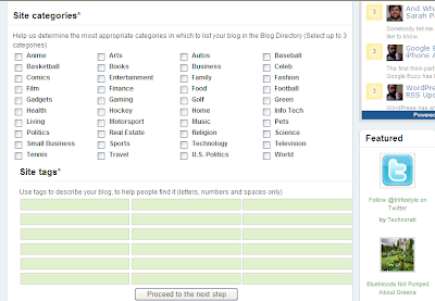
If search is king and therefore tags and categories important to any Internet property, isn't it natural to have category suggestions for submission of websites to be as broad as reasonably possible? Or so one would think.

Apparently not. I tried submitting my photo blog about Chennai to Technorati and it forced me to slot it into three categories - world, travel and living - that hardly defines it appropriately. Photography could have been a possible category. Places could have been another category. And 'regional' too? I believe that is a broad enough category when there are a million blogs out there on the said subjects.

But Technorati doesn't think so. Pin It Now!

Many marketers still miss this point

Pin It Now!


So here’s another example of ‘simple’.

It came in my mailbox this afternoon. Holi greetings from Indigo. Maybe they should have checked to see if their mail would be delivered without hitches. Because I remember that it was a while before the mail opened and that too in a new window.

But I came back to my desk to see this pleasant greeting.

Will I fly Indigo because of this? Sure! I was impressed with the airline right from the word go. Low cost they may be, but they’re by no means cheap like some other airlines I know. And they take care of the little things.

Like the simple yet warm Hoil greeting. So what if the greeting was nothing but their animated logo? I’m still impressed. I’m left feeling good. And feeling good = a good impression about Indigo in this case. Pin It Now!

Blind Spots. Ouch! I missed that!

Pin It Now!

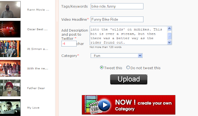
Here's a typical example of a blind spot. And this is on TwitSnaps Videos. They apparently wanted to make known their new functionality which involves adding your own category to your video. Recall that when you upload a picture or a video on any social networking website, you need to slot it into a category?

Most social websites do not allow you to create a category of your own, which if you ask me is rather bull headed. Because some content cannot fit into set categories. But TwitSnaps Videos does as I found out AFTER I uploaded my video and was waiting for the upload to complete.

There below all the required fields and text boxes I chanced, literally chanced upon a red banner ad proclaiming "NOW! create your own Category

Bad banner. Bad punctuation, if you notice. Bad placement. And why for Godzilla's sake do they need a banner? Wouldn't a simple text link next to the category field dropdown do? In which case I would have seen it. And not categorized my vid under 'Fun'. Pin It Now!

‘Simple’ sells. At least it gets attention...

Pin It Now!
This mailer actually caught my attention in my Rediffmail inbox. It must have been the subject line too. Or I wouldn't have opened it in the first place, even though I’ve subscribed for it.

(Now that's another point of debate. Though we subscribe to e-mailers, we often don't read them. Or only browse through them at a lightening pace. Unless it's about something really, really close to our heart. Unless it's something we can get an immediate benefit from. But that's the topic of another post.)

Coming back to the mailer… It's the simplicity of the message, without any seemingly clever puns and turns of phrases along with the crisp, clean imagery that caught me.

I actually read this mail.

And were I so inclined, I would have taken up on the offer, but for the fact that I wasn't interested then for various reasons.

But the mailer achieved its purpose. One, it put me in a good frame of mind as I thought back on some of the recent holidays I'd been on. Two, I filed the company name away for future reference. (No, not physically. I filed it away in my mind. And I know it will stay there because I filed it away when I was in a good frame of mind.)

‘Simple’ sells. Simplicity works. If someone tells you it doesn't, pay no attention.
Pin It Now!

Boo! Boo! Yahoo... II

Pin It Now!
I'd posted in March 2009 about the closure of Yahoo! Briefcase. Barely 5 months later here I am posting about the closure of Yahoo! 360°. I quote their mail to me:

"We will be officially closing Yahoo! 360° on July 13, 2009, to focus our efforts on making your new profile on Yahoo! the place where you connect with the people who matter to you most. As a result, you will need to move your 360° information to your new profile before this date. After July 12, 2009, your content on Yahoo! 360° will no longer be accessible." (Click on image to enlarge).

Yahoo! Photos. Yahoo! Briefcase. And now Yahoo! 360°.

How does Yahoo! plan to prevent the erosion of trust in their service? What guarantees can they put forth that they will not close more of their services and inconvenience more people with having to shift their digital property to other places?

Shifting digital property is like a house move. It's a pain.

So to avoid that pain what do you think sensible Yahoo! users would do? Avoid Yahoo! like the plague and shift everything important that has to be shifted to other services in anticipation of another (imminent?) closure. Pin It Now!

Youtube - Messing it up locally

Pin It Now!
This (click on image to enlarge) is what happened when I tried to retrieve my username and password on Youtube. They sent me a mail in Hindi! I do not correspond in that language ever. I studied Hindi in school. It was my second language, that doesn't mean that I am comfortable with that language in daily use, especially in writing. And no way in e-mail. Not when I'm trying to figure out something like my username and password.

If someone at Youtube is listening, Hindi might be the official National Language of India. That doesn't mean that it's lingua franca around here. I hardly get to speak the language and never get correspondence in Hindi. It's not just me; it's half of India, mostly from the south.

Isn't it important that you get your basics right? Don't make conclusions based on geography, if you don't know your geography.
Pin It Now!

Simple is always the winner

Pin It Now!
It's rather too early to tell, but by the look of things to come, WolframAlpha, the computational knowledge (search) engine has taken a chapter from Google after all. It's called 'keep it simple'. Simple is always the winner no matter what you are packaging, even if it is a mystic web property that can ostensibly do magic. (This website supposedly computes answers to any factual question.)
Pin It Now!

Customise. Customise.

Pin It Now!
Q: How much can you customise a communication piece?

A: As much as possible.

Try to blend in with the colours of the inbox if it is an e-mailer you are sending. It makes for a pleasant read and chances are that the recipient just might read the first few lines instead of clicking the delete button. It helps if your logo blends well with the colour of the inbox too. And if it is placed on the top. Instant recognition. And then instant recall... "I remember this mail from (enter your company name here)".
Pin It Now!

Boo! Boo! Yahoo...

Pin It Now! I'm not sure what Yahoo is up to. Here's quoting their mail:

"We will officially close Yahoo! Briefcase on March 30, 2009. Until then, we are offering you the opportunity to download your files back to your computer. You need to take action before we close, after which any files remaining on Yahoo! Briefcase will be deleted and no longer accessible."

Now it's Yahoo! Briefcase.

Earlier it was Yahoo! Photos. I know. I lost a few albums.

My take: Yahoo! is not for me if I'm going to store something. I use Yahoo! Mail a lot less now than I used to. I check my mailbox once a month or two, perhaps. Put it down to eroding trust. And if trust is what brands are built on, Yahoo! is speeding down Eroding Highway. Pin It Now!

Sitting around makes Jack a dull boy

Pin It Now! If you've straddled both offline and online advertising, you'll notice that the playing fields are different in each case. Of all the differences, this one's the biggest - idle time. You find yourself sitting idle more than you used to in the offline/mainline space.

Q: What do you do then?

A: You keep up. And to do that you not only follow what's happening in the other world (the offline/mainline world). But you also try to do your bit to get involved in it. And it's eminently practical.

Tomorrow your online agency could take on offline work. That's when you can add another feather to your current online portfolio and even fill up online idle time. Anyway you think about it, it pays in the long run. Pin It Now!